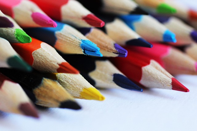
The Building Blocks: Hue, Value, and Chroma
Before diving into mixing, it’s essential to grasp the core components of colour: hue, value, and chroma. Hue refers to the pure colour itself – red, blue, yellow, and so on. It’s what we typically think of when we name a colour.
Last updated: May 30, 2026
Value, on the other hand, is the lightness or darkness of a colour. This is crucial for creating depth and form. Chroma, also known as saturation or intensity, is the purity or brightness of a colour. A highly saturated colour is vivid, while a desaturated colour appears duller, often leaning towards grey.
Your Compass: The Colour Wheel Explained
The colour wheel is an artist’s best friend for understanding colour relationships. It organizes colours based on their position in the spectrum, illustrating how they interact.
At its heart are the primary colours: red, yellow, and blue. These can’t be created by mixing other colours. Combining them, however, unlocks a world of new hues. For instance, mixing red and yellow yields orange, a secondary colour. Blue and yellow create green, and red and blue produce violet. These secondary colours sit between the primaries on the wheel. Mixing a primary and an adjacent secondary colour creates tertiary colours, such as red-violet or blue-green.
The Split Primary Palette: A Smarter Start
While a basic set of red, yellow, and blue is sufficient, many experienced artists opt for a split primary palette. This involves having two versions of each primary colour: a warm and a cool one. For example, a warm red might be Cadmium Red (more orange-leaning), while a cool red could be Alizarin Crimson (more blue-leaning).
This approach offers significantly more control. Mixing a warm yellow with a cool blue, for instance, will produce a more vibrant green than mixing two ‘neutral’ primaries. According to artist guides published in 2026, a split primary palette can dramatically improve the vibrancy and range of your mixes, especially for landscape and portrait painting.
Adjusting the Dial: Tints, Shades, and Tones
Once you have a base hue, you’ll often need to adjust its lightness, darkness, or intensity. This is where tints, shades, and tones come into play.
A tint is created by adding white to a colour, making it lighter. A shade is made by adding black, making it darker. Adding grey to a colour produces a tone, which reduces its intensity or saturation.
Be mindful when adding black. Pure black can sometimes dull colours excessively. Many artists prefer to create their own ‘black’ by mixing a deep blue (like Ultramarine) with a deep red (like Alizarin Crimson) or a mix of primary colours. This often results in a richer, more nuanced dark colour than a pre-mixed black.

The Pitfall of Mud: Strategies for Clean Mixing
Perhaps the most common frustration for beginners is creating muddy or dull colours. This often happens when complementary colours are mixed without intention, or when too many colours are combined.
Complementary colours are those opposite each other on the colour wheel (e.g., red and green, blue and orange, yellow and violet). Mixing them directly neutralizes each other, resulting in browns, greys, or muted tones. While useful for creating earthy neutrals, accidental mixing of complementaries leads to mud.
To avoid this, try to keep your mixing area clean. Use a palette knife to mix colours, rather than brushing them together on the palette. If you need to mix a specific shade between two colours, try to use colours that are closer on the wheel, or add one colour very gradually to the other. For example, to mix a muted orange, start with yellow and add red sparingly, or mix orange with a touch of its complementary blue or grey.
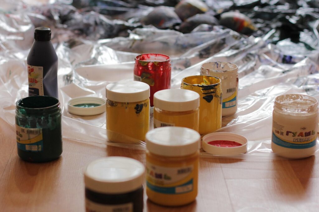
Hands-On Techniques for Vibrant Acrylics
Mixing acrylics requires a systematic approach. Begin with your desired hue and gradually introduce other colours or modifiers.
Start Small: Always mix a small amount of the desired colour first. You can always add more paint, but you can’t easily remove it if you’ve mixed too much or the wrong shade. A small dab of each required colour on your palette is usually sufficient.
Use a Palette Knife: A palette knife is excellent for thoroughly blending colours. It ensures all pigments are evenly distributed, leading to a more uniform and predictable result. Brushes can leave streaks and may not blend as efficiently.
Work from Light to Dark (or vice versa): Depending on your goal, you can either add darker colours to a light base or lighter colours to a dark base. Adding a dark colour to a large amount of light colour requires more pigment to change the hue. Conversely, adding a light colour to a small amount of dark colour can lighten it quickly.
Consider Acrylic Mediums: Beyond just colour, mediums can alter the paint’s texture, transparency, and drying time. Glazing mediums, for example, create transparent layers, allowing for subtle colour shifts and depth, much like watercolor techniques. According to Art & Design publications as of early 2026, the use of specialised mediums is becoming increasingly popular for achieving unique finishes.

Example Mixes: From Greens to Greys
For a bright, grassy green, use a pure yellow (like Cadmium Yellow Light) and a bright blue (like Cerulean Blue). For a muted or olive green, use a darker blue (like Ultramarine) and a warmer, earthier yellow (like Yellow Ochreaa), or add a touch of red or grey.
Making Oranges: Mix red and yellow. For a vibrant orange, use Cadmium Red and Cadmium Yellow. For a softer peach or terracotta, use Alizarin Crimson with Yellow Ochre, or add white and a touch of grey.
Making Violets/Purples: Combine red and blue. A bright violet can be made with Alizarin Crimson and Ultramarine Blue. For a more muted or grayish purple, use a warmer red and a cooler blue, or add a touch of its complementary yellow.
Making Neutrals (Browns & Greys): These are often made by mixing complementary colours or all three primaries. A common brown mix is red, yellow, and blue. Alternatively, mixing orange and blue, or violet and yellow, will yield browns. To create greys, you can mix black and white, or more subtly, mix a colour with its complementary hue.
Common Pitfalls in Acrylic Colour Mixing
Beyond muddy colours, other common mistakes include using too much white or black, and not understanding paint consistency.
Overusing White: Adding white to lighten a colour can sometimes make it chalky or pasty if too much is used. Consider using a lighter, more transparent colour (like a light yellow or even a pale blue for a warm hue) to achieve a lighter value without losing saturation.
Overusing Black: As mentioned, pure black can kill vibrancy. Explore creating your own deep neutrals by mixing dark primaries or complementary colours. If you must use black, try mixing it with a tiny amount of a complementary colour to keep it from looking flat.
Inconsistent Consistency: Acrylic paints vary in thickness. Ensure your paint is at a workable consistency for mixing. If it’s too thick, add a small amount of water or acrylic medium to achieve a smooth, buttery texture suitable for blending.
Expert Tips for Continuous Colour Mastery
Developing skill in acrylic colour mixing is an ongoing journey. Here are some tips to foster continuous improvement:
Keep a Colour Mixing Journal: Document your experiments. Swatch colours, record the mixes you used to achieve them, and note how they look next to each other. This visual diary becomes an invaluable reference.
Experiment with Different Brands: While colour theory is universal, the pigment load and quality can vary between brands. Understanding how different manufacturers’ paints behave can enhance your mixing capabilities.
Study the Masters: Look at the work of artists whose colour palettes you admire. Analyse how they use colour to create mood, depth, and harmony. Many art history resources and museum websites offer detailed analyses of colour usage.
Trust Your Eyes (and Your Gut): While rules are important, your artistic intuition will develop with practice. Don’t be afraid to experiment and deviate from the ‘rules’ once you understand them. Sometimes, the most beautiful colours are born from happy accidents.

Frequently Asked Questions
What are the three primary colours in acrylics?
The three primary colours in acrylics are red, yellow, and blue. These colours are fundamental because they can’t be created by mixing other colours, serving as the base for all other hues.
How do I make green with acrylic paint?
To make green, mix blue and yellow acrylic paints. The specific shades of blue and yellow you use will determine the resulting green. Using a bright blue with a pure yellow creates a vibrant green, while earthier tones will produce muted or olive greens.
What happens when you mix complementary colours in acrylics?
When you mix complementary colours (those opposite each other on the colour wheel), they neutralise each other. This typically results in muted tones, browns, or greys, which can be useful for creating earthy colours or shadows but can lead to ‘muddy’ results if done unintentionally.
How can I make my acrylic colours more vibrant?
To achieve more vibrant acrylic colours, use pure pigments where possible, avoid over-mixing with complementary colours or black, and consider using a split primary palette. Ensure your paints are of good quality and have a high pigment load.
Is it better to add white to dark colours or dark colours to white?
Generally, it’s more efficient to add a small amount of dark colour to a larger amount of white to create a tint. Adding a large amount of white to a small amount of dark colour can dilute the pigment too much, leading to chalky or weak results.
Can I mix black and white acrylic paint to make grey?
Yes, mixing black and white acrylic paint is the most straightforward way to create grey. However, for more nuanced greys, you can also mix a colour with its complementary hue, or mix all three primary colours together in varying proportions.
Your Colorful Journey Awaits
Understanding how to mix acrylic paint colours is a journey of exploration and practice. By grasping the principles of the colour wheel, the nuances of hue, value, and chroma, and employing deliberate mixing strategies, you can unlock a boundless palette.
Start with a few basic colours, experiment diligently, and don’t shy away from making ‘mistakes’ – they are simply opportunities for learning. Your ability to mix colours won’t only enhance your artwork but also deepen your connection to the creative process.
Last reviewed: May 2026. Information current as of publication; pricing and product details may change.
Source: Britannica
Related Articles
- Best Way to See Boston: UK Traveller's Guide 2026
- Boost Classroom Presence with NeuronPostShop: 2026 Guide
- p5x Classroom Answers: A 2026 Guide for UK Educators
Editorial Note: This article was researched and written by the Class Room Centre editorial team. We fact-check our content and update it regularly. For questions or corrections, contact us.