The Foundation: Line
This guide covers everything about what are the elements of art and design. Line is the most basic element, a mark with greater length than width. It can be straight, curved, thick, thin, or implied. Lines guide the viewer’s eye, define shapes, create texture, and suggest movement or direction.
For instance, a series of sharp, jagged lines might evoke feelings of anger or tension in a painting, while smooth, flowing lines in a logo can suggest elegance and harmony. Consider how many website navigation bars rely on clean, horizontal lines for a sense of stability and order.
Practical Insight: Experiment with different line weights and styles in your sketches to see how they alter the mood and structure of your composition. A thick, bold line can anchor a design, while a thin, delicate one can add subtlety.
Defining Worlds: Shape and Form
Shape refers to a two-dimensional area that’s defined by an outline or boundary. It can be geometric (like circles, squares, and triangles) or organic (like those found in nature, such as leaves or clouds).
Form, on the other hand, is three-dimensional. It has height, width, and depth, and can be depicted through shading, perspective, or actual sculptural elements. A circle is a shape; a sphere is a form.
In graphic design, the precise geometric shapes used in a corporate logo communicate professionalism and structure. In sculpture, the organic forms of a human figure can convey movement and emotion.
Practical Insight: When designing, pay attention to the negative space around shapes and forms. The areas you don’t fill can be just as important as the areas you do, defining boundaries and creating balance.
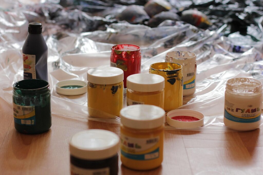
The Emotion of Pigment: Colour
Colour is one of the most powerful elements, directly influencing mood and perception. It has three main properties: hue (the pure colour, like red or blue), saturation (the intensity of the colour), and value (the lightness or darkness of the colour).
According to Adobe’s 2026 Colour Trends report, vibrant, optimistic hues are gaining traction in digital interfaces, while earthy tones remain popular for brands emphasizing sustainability. For example, bright blues and yellows can create a feeling of energy and joy, whereas deep purples and greys might convey sophistication or solemnity.
Practical Insight: Understanding basic, including complementary, analogous, and monochromatic schemes, can dramatically improve your colour choices. Use online tools like Adobe Colour to explore palettes and ensure visual harmony.
Light and Shadow: Value
Value refers to the lightness or darkness of a colour or tone. It’s what allows us to perceive form and depth in a two-dimensional image through contrast. A full range of values, from pure white to deep black, creates a sense of three-dimensionality.
In photography and film, dramatic value contrasts (chiaroscuro) can heighten tension and emphasize subjects. A portrait rendered with subtle value gradations will appear more lifelike than one with flat, uniform colour.
Practical Insight: When working in black and white or grayscale, value becomes the primary tool for creating interest and depth. Practice sketching objects using only different shades of grey to master this element.
Surface and Feel: Texture
Texture is the perceived surface quality of an object – how it feels or looks like it would feel if touched. It can be actual (physical, like the rough surface of sandpaper) or implied (visual, like the depiction of fur in a painting).
In interior design, combining different textures – smooth silk, rough wood, soft velvet – adds richness and sensory appeal to a space. In digital design, using patterns that mimic natural textures can make interfaces feel more grounded and tactile.
Practical Insight: Think about how texture can enhance the user experience. For instance, a website button with a subtle brushed metal texture might feel more substantial and clickable than a flat, featureless one.
The Empty Canvas: Space
Space refers to the area within, around, between, or above objects. It can be positive (the areas occupied by elements) or negative (the empty spaces). Artists and designers manipulate space to create balance, depth, and focus.
The principle of ‘breathing room’ in layout design is a direct application of using negative space effectively. A crowded poster with little white space can feel overwhelming, while a well-spaced layout guides the eye and enhances readability. According to ISTE (International Society for Technology in Education) guidelines, digital environments should be designed with ample clear space to reduce cognitive load for learners.
Practical Insight: Consider the interplay between positive and negative space. Sometimes, what you omit is as crucial as what you include for achieving a clear and impactful design.
Beyond the Elements: Principles of Design
While elements are the ‘what,’ the principles of design are the ‘how’ – how the elements are organised. Common principles include balance, contrast, emphasis, movement, pattern, rhythm, and unity. These principles work in concert with the elements to create cohesive and compelling visuals.
For example, contrast (a principle) uses value and colour (elements) to create emphasis on a key focal point. Unity is achieved when all the elements work together harmoniously.
Practical Insight: Mastering the elements is the first step; learning to apply the principles thoughtfully is what transforms a collection of parts into a unified, intentional design.
Real-World Application: Examples in Practice
Consider the design of a smartphone app. The line might be used for dividing content sections, shapes for buttons and icons, colour for branding and highlighting interactive elements, value for creating depth on buttons, texture for backgrounds that mimic materials, and space to ensure clarity and ease of navigation.
A well-designed app, like those from Apple or Google, expertly balances these elements. For example, Apple’s Human Interface Guidelines, updated in 2026, emphasize clarity through consistent use of white space and subtle colour accents to guide user interaction. This demonstrates how mastering the elements leads to intuitive and aesthetically pleasing user experiences.
Another example is a museum exhibition. Curators use the elements of art and design to guide visitors through the space and tell a story. The placement of sculptures (form and space), the colour of the walls (colour), the lighting (value), and the texture of display materials all contribute to the overall narrative and emotional impact.
Common Mistakes When Using Design Elements
One common pitfall is an over-reliance on a single element, leading to a monotonous design. For instance, a poster that uses only bold lines and no colour variation might feel harsh and uninviting.
Another mistake is poor colour choices that clash or create legibility issues. This is particularly problematic in educational materials or user interfaces, where clarity is paramount. According to recent usability studies, colour contrast ratios below 4.5:1 can significantly hinder comprehension for a percentage of the population.
Failing to consider negative space can result in cluttered, overwhelming designs that are difficult to process. Conversely, too much empty space without clear focal points can make a design feel sparse or unfinished.
Tips for Mastering the Elements
Actively analyse designs you encounter daily. Break down advertisements, websites, and packaging into their constituent elements and principles. What makes them work (or not work)?
Practice, practice, practice. Sketching, digital drawing, and even arranging objects around your home can hone your understanding. For visual designers, dedicating time to digital painting or 3D modelling exercises, even outside of client work, builds fluency.
Seek feedback. Share your work with peers or mentors and ask specific questions about how the elements are functioning. Constructive criticism is invaluable for growth.
Stay current with design trends. While the core elements are timeless, their application evolves. Following reputable design publications like AIGA’s Eye on Design or observing how leading brands like Nike or Google implement these elements in 2026 can provide inspiration.
Frequently Asked Questions
What are the main elements of art and design?
The core elements are line, shape, form, colour, value, texture, and space. These are the foundational components that artists and designers manipulate to create visual compositions and communicate ideas effectively.
How do elements differ from principles of design?
Elements are the basic visual units (like line or colour), while principles are the ways these elements are organised and arranged (like balance, contrast, and unity) to create a successful design.
Why is understanding colour value important?
Value, the lightness or darkness of a colour, is crucial for creating depth, dimension, and contrast. It allows us to perceive form and helps guide the viewer’s eye through a composition.
How does texture influence a design?
Texture affects how a surface looks or feels. In visual design, it can add depth, interest, and a tactile quality, influencing the viewer’s emotional response and perception of the piece.
Can space be both positive and negative?
Yes, space refers to the area within and around objects. The main subjects occupies positive space, while negative space is the empty or background area, both of which are vital for composition.
Are the elements of art the same for graphic design and fine art?
While the core elements are universal, their application and emphasis may differ. Graphic design often prioritizes clarity and communication, while fine art might explore subjective expression and emotional depth.
Conclusion
The elements of art and design are the essential vocabulary for visual communication. Mastering line, shape, form, colour, value, texture, and space provides the foundation for creating impactful and meaningful visuals, whether you’re painting a canvas or designing a digital interface.
Actionable Takeaway: Choose one element of art and design this week and consciously focus on its application and impact in at least three different visual contexts you encounter.
Source: Britannica
Editorial Note: This article was researched and written by the Class Room Centre editorial team. We fact-check our content and update it regularly. For questions or corrections, contact us.
Related read: Drawing on Classroom: A 2026 Guide for Educators. For readers asking “What are the elements of art and design”, the answer comes down to the specific factors covered above.